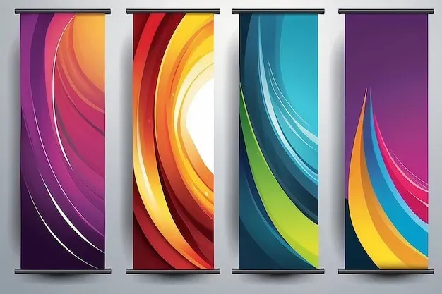
Custom Banner Color Theory is a silent salesman, shaping perception, guiding attention, and nudging viewers toward action across banner placements, sizes, contexts, and digital environments. Understanding banner color psychology helps you influence mood, readability, and urgency without shouting, while aligning with user expectations across devices and screen sizes. This approach blends color theory with practical palettes that reinforce your brand and maintain clear visual hierarchy, ensuring accessibility and legibility across varied backgrounds. A cohesive palette can make your call to action stand out while remaining true to your identity, fostering trust and reducing friction in the conversion path. By testing variations and listening to data, you can turn first impressions into measurable engagement, optimizing banners for clicks, signups, and long-term loyalty.
Beyond the terminology, the concept translates into a pragmatic color strategy for banners: think of hue choices as signals that support your message, not mere decoration. Visual cues, contrast, and consistency work together with your brand voice to create a responsive design language that resonates with audiences across contexts. This second framing emphasizes a brand-led palette, legibility, and CTA emphasis, while keeping accessibility in focus. Color semantics and contextual awareness help deliver a seamless user journey from impression to action, regardless of device or platform. When you couple these principles with ongoing testing and analytics, you convert theory into tangible performance improvements across campaigns.
Custom Banner Color Theory: How Purposeful Hues Boost Conversions
Custom Banner Color Theory treats color choice as a strategic lever for outcomes, not just a design flourish. By aligning hue with brand promise, message tone, and audience expectations, banners can communicate intent even before the copy is read. This approach draws on banner color psychology, color theory for banners, and practical palette decisions to shape mood, readability, and persuasion. The goal is to select hues that quietly guide attention toward the call to action and, ultimately, drive clicks and conversions.
To put this into practice, define the conversion goal, identify the target audience, and then map a color system that supports that objective. Establish a dominant hue, a supporting hue, and a CTA color that aligns with your brand. A cohesive palette reduces visual noise and ensures the CTA stands out without clashing with the overall banner color schemes, producing colors that convert across multiple placements and devices.
Banner Color Psychology: Aligning Emotions, Trust, and Action
Colors carry emotional cues that influence perception and behavior. Banner color psychology helps explain why red can signal urgency and orange can prompt proactive engagement, while blue often conveys reliability and trust. When these signals match your brand voice and audience expectations, banners feel purposeful rather than arbitrary, increasing the likelihood of engagement and action.
To leverage psychology effectively, tailor hues to your audience segment and context. A tech SaaS banner might employ cool blues to convey professionalism, whereas a lifestyle banner could use warm tones to evoke energy. The emphasis is on selecting hues that align with your brand promise and the action you want users to take, reinforcing the overall message with a color language that supports conversion-focused color palettes.
Color Theory for Banners: Practical Rules to Improve Readability and CTA Impact
Color theory for banners emphasizes readability, contrast, and visual hierarchy. Ensure high-contrast combinations so body copy remains legible against backgrounds, and use harmonious schemes to maintain brand credibility. Accessibility always comes first; WCAG-compliant contrast ratios ensure readers across devices and assistive technologies can engage with your message.
A practical approach to hue hierarchy places the background, body text, and CTA on distinct visual weights. The CTA color should pop enough to attract attention but stay within the brand’s color system. When planning, consider how context—banner size, placement, and surrounding imagery—affects perception, and craft banner color schemes that remain legible and compelling across scenarios.
Banner Color Schemes That Convert: Building Cohesive, Conversion-Focused Color Palettes
Banner color schemes provide a blueprint for consistent visuals that support performance. Start with 2–4 core hues: a dominant background color, a supporting shade for accents, and a bright CTA hue to drive action. Pairing these thoughtfully helps create conversion-focused color palettes that feel intentional and aligned with brand identity.
Industry-driven palettes offer practical starting points. For example, e-commerce banners may favor a deep navy backdrop with a bold red or orange CTA, while SaaS banners lean toward blues and cool grays punctuated by a lime or electric blue CTA. These examples illustrate how curated combinations influence perception, readability, and the likelihood of clicking, all while reinforcing your banner color schemes and the broader brand story.
Testing and Optimizing Colors That Convert: Data-Driven Techniques for Banner Performance
Testing turns color theory into tangible gains. Formulate hypotheses such as “switching the CTA color from blue to orange will increase CTR,” then create 2–3 banner variants that keep messaging constant while varying hues. This experimentation, anchored in A/B testing, helps identify which banner color psychology cues and palette choices actually drive engagement.
Measure success with clear metrics like click-through rate (CTR), conversion rate, and post-click engagement. Gather enough data to reach statistical significance and document which hues or combinations outperform others. Iteration should be systematic: refine the dominant and CTA colors, reassess contrast and accessibility, and re-test to optimize for colors that convert across your audience and placement contexts.
Frequently Asked Questions
What is Custom Banner Color Theory and how does banner color psychology influence conversions?
Custom Banner Color Theory is the deliberate use of color to influence mood, readability, and actions in banner advertising. By applying banner color psychology—understanding how hues signal urgency (red), trust (blue), or growth (green)—and aligning with your brand and CTA, you can choose banner color schemes that improve contrast, readability, and conversion. This approach blends color psychology with practical palette strategies to guide viewers toward clicking.
How does color theory for banners guide selecting banner color schemes that maximize conversions?
Color theory for banners focuses on contrast for legibility, harmony for brand consistency, and emphasis to draw attention to the CTA. By limiting your primary palette to 2–4 hues and ensuring the CTA color pops while staying brand-aligned, you create banner color schemes that support conversions while remaining accessible.
How can you build colors that convert using conversion-focused color palettes within Custom Banner Color Theory?
Start with a brand-aligned color system: one dominant hue, a supporting hue, and a CTA accent. Create a clear color hierarchy for background, body text, and CTA, then assemble palettes tailored to context (e-commerce, SaaS, health, etc.). Use testing—A/B variants and metrics like CTR and conversion rate—to identify the conversion-focused color palettes that perform best.
What is the role of testing in Custom Banner Color Theory when refining banner color schemes?
Testing translates theory into results. Use hypotheses like changing the CTA color to test impact on CTR, create 2–3 banner variations, and measure CTR, conversion rate, and time on page. Ensure tests run long enough for statistical significance and document which hues drive the best performance.
What accessibility and readability considerations are essential in Custom Banner Color Theory for banners?
Accessibility matters in banner color schemes. Aim for WCAG contrast ratios (4.5:1 for body text, 3:1 for large text), verify with color contrast tools, and include color-independent cues (bold typography, icons) to support readers with color vision deficiency. This ensures wide reach without compromising the color strategy.
| Aspect | Key Points |
|---|---|
| Overview |
|
| Core Principles |
|
| Psychology of Colors |
|
| Practical Rules |
|
| Step-by-Step Approach |
|
| Palette Examples |
|
| CTA and Color Pairing |
|
| Accessibility & Readability |
|
| Testing & Optimization |
|
| Common Mistakes |
|
| Tools & Resources |
|
Summary
Conclusion